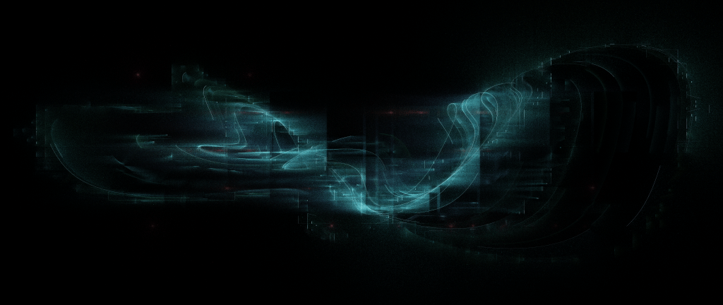
A series of generative art experiments I’ve been iterating on over the last few weeks. These are all direct outputs from Processing, rendered at ultrawide/21:9 5120×2160. Initially I was working on some supplemental imagery to support my album release and refresh some of my music site profiles, but I ended up having a lot of fun playing with these algorithms and developing them further. They’re quite dark overall as I tend to work on them at night in fullscreen mode and don’t like blowing out my eyeballs with bright values when rendering; also the subtlety of darker tones works better as backdrops for light text on various profiles.

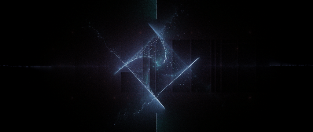
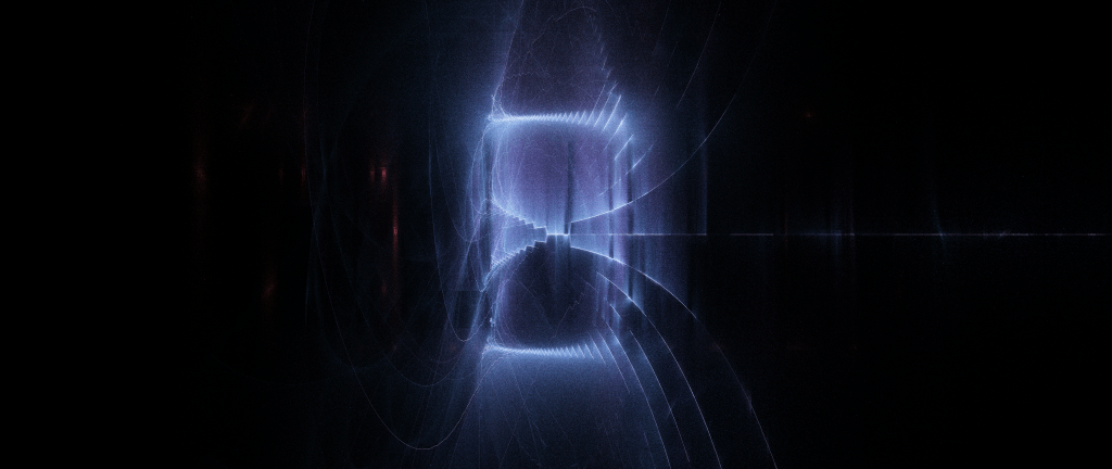
These are all based on a system of line segments that randomly emit tiny dots from their “normal” (which is just offset 90 degrees from the angle between their vertices). The brightness is based on the inverse square distance to a center point in the series of segments, which isn’t necessarily contiguous. Helpful to maintain the illusion if it is, but also fun to break the rule for more glitchy effects as I experimented with later on. Anyway that “brightness” value is also used to drive other parameters like hue shift, angle spread, and distance from the segment.
I was happy with this effect but also wanted to create the illusion of some areas being blurred, out of focus, or in shadow, so I also created a series of “invisible” polygons. When a dot’s position ends up within one of these polygons, some of the properties change, mainly angle, value and distance from the segment, but I experimented with many other effects in this area like hue shifts, applying perlin noise to the angle and distance, or gaussian blurring.
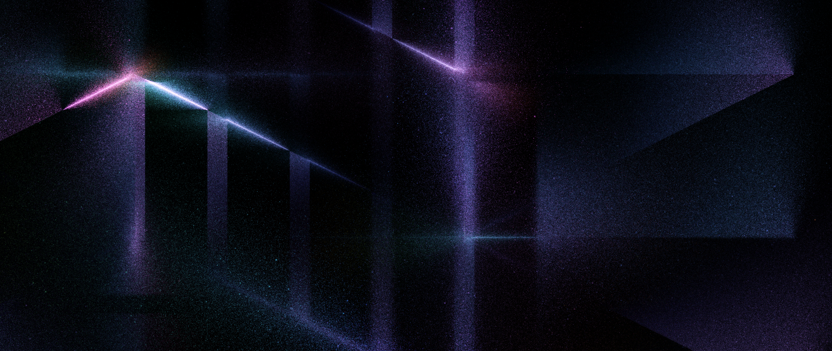
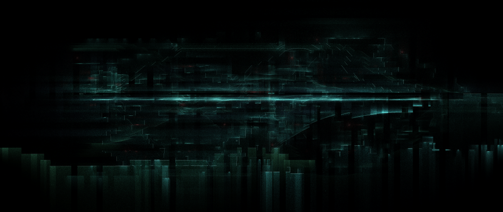
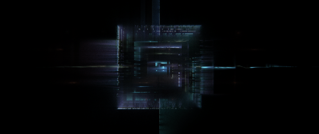
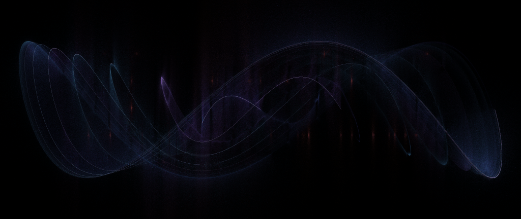
From here I wanted to break out of the initial grid and started experimenting with other shapes. My rough guiding principle was the idea of finding beauty at the intersection of order and chaos, so to that end I tried to include some mixture of controlled shapes and randomness, hard edges and curves, grids and noise.

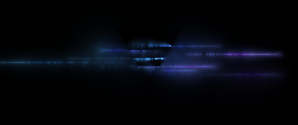
Also experimented with adding a little chromatic aberration to the rendering based on distance to the center of the screen.

A vague question that kept arising for me here was where to make the division between planned composition and randomness. In my previous generative efforts I felt a stronger compulsion to aim for randomness, but pure randomness doesn’t make for great compositions without a ton of work. And even then, doesn’t that large amount of work ultimately amount to just a wider variety of planned compositions in a different way? So this time around I tried to feel less “constrained” by the idea of requiring the overall composition to result from randomness in generative techniques and just go with what I felt would look cool.

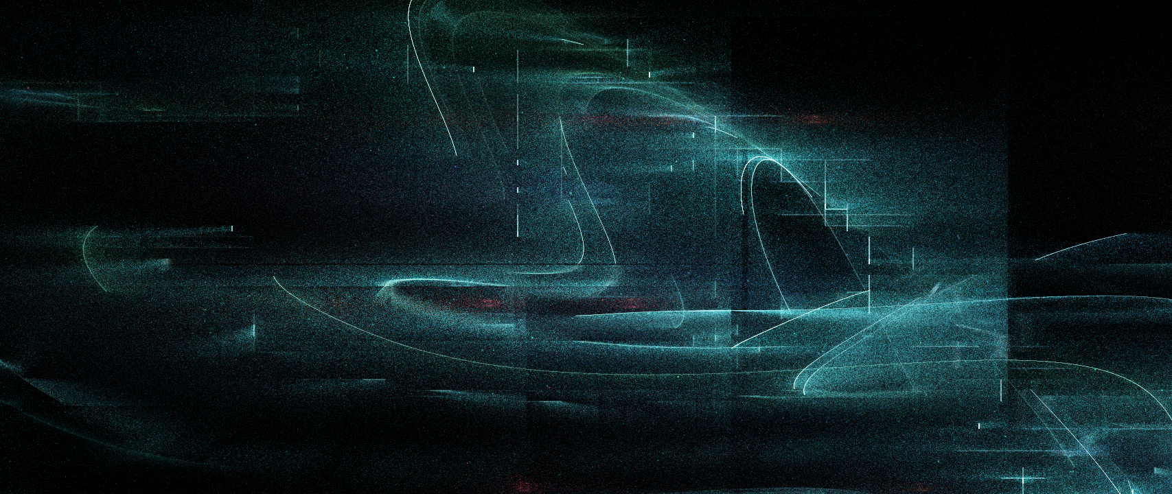


I also tried to embrace happy accidents as much as possible – for example here I did not intend for a central symmetry, but it came out that way because I’m working with (0, 0) at the center of the screen and forgot to offset the Perlin noise (which in Processing is symmetrical at the origin) to account for that.


I recently learned about OKlab color space and tried out using this implementation for these experiments. I think it does indeed provide some very nice color transitions compared to the default HSV.

Gallery of full resolution images (please zoom in for full effect!):